


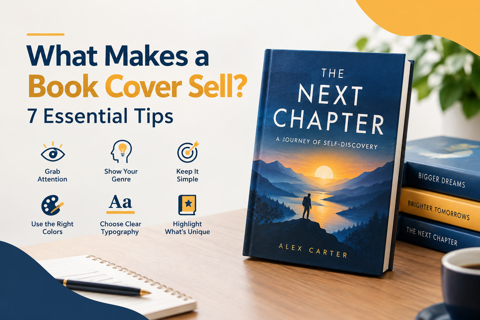
In a digital marketplace with millions of titles competing for attention, readers do judge a book by its cover. Before a potential buyer reads your compelling blurb or samples your first chapter, your cover image has less than two seconds to make an impression as they scroll through search results or social media feeds.
Whether you are self-publishing or working with a traditional press, understanding the elements of a high-converting cover design is critical to your book’s commercial success. Here are 7 essential design principles every author must know to turn casual browsers into paying readers.
Whether you are self-publishing or working with a traditional press, understanding the elements of a high-converting cover design is critical to your book’s commercial success. Here are 7 essential design principles every author must know to turn casual browsers into paying readers.
1. Clear Genre Alignment
Your book cover’s primary job isn’t just to look pretty—it’s to signal genre and tone. Readers rely on visual cues to instantly identify whether a book fits their reading preferences.
Thriller & Mystery: High-contrast color palettes, dark backgrounds, silhouette figures, bold sans-serif typography.
Romance: Soft pastel or warm tone gradients, illustrated couples or thematic motifs, elegant script fonts.
Non-Fiction & Self-Help: Clean layouts, high readability, minimalist iconography, dominant primary colors.
2. A Single, Striking Focal Point
Cluttered covers confuse readers. A strong, effective design relies on one dominant element that anchors the layout—whether that is a compelling character portrait, a central symbol, or a striking title design.
Avoid trying to summarize your entire plot on the cover. Instead, choose one visual hook that evokes the core emotion, theme, or tension of your narrative.
3. High-Contrast, Readable Typography
Typography is often the deciding factor between an amateur cover and a professional bestseller. Your title and author name must be legible across all screen sizes and formats.
Hierarchy: Make the title the largest element, followed by the author name and secondary text (subtitles or endorsements).
Contrast: Ensure the font color stands out cleanly against the background image. Use drop shadows or gradients subtly if extra contrast is needed.
Font Selection: Stick to 1 to 2 complementary font families. Overusing decorative fonts makes the cover look chaotic and unprofessional.
4. The Thumbnail Test (Mobile Optimization)
Over 70% of book discovery happens on mobile screens via Amazon, Goodreads, and social platforms. On these displays, your cover appears as a tiny thumbnail barely an inch tall.
How to test your design:
Scale your cover design down to 100 pixels wide.
Check if the title is still readable.
Verify that the main image doesn’t turn into an unrecognizable blur.
If your cover loses its punch when shrunk, simplify the layout and increase contrast.
5. Strategic Use of Color Psychology
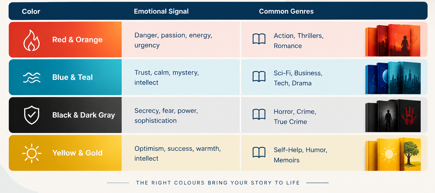
Colors evoke immediate emotional responses before the brain even processes words or images. Using strategic color choices helps set the mood of your story immediately:
6. Social Proof and Subtitles (When Applicable)
If you have valuable credentials, a compelling subtitle, or an endorsement from an established figure, include it on the front cover.
Non-Fiction: A clear, benefit-driven subtitle explains why the reader needs the book (e.g., “How to Master Focus in a Noisy World”).
Fiction: Endorsement quotes or award badges (e.g., “USA Today Bestselling Author”) build instant trust and lower the buyer’s hesitation.
Keep these secondary text elements small so they complement the main title without overcrowding the design.
7. Professional Formatting Across Formats
A great cover design must translate seamlessly across all publication formats:
Ebook: High-resolution RGB file optimized for digital screens.
Paperback & Hardcover: Full-bleed CMYK print files including front cover, exact spine width calculated by page count, and back cover layout with ISBN barcode space.
Audiobook: Square 1:1 aspect ratio layout optimized for platforms like Audible and Spotify.
Ensuring your design adapts properly across all formats prevents awkward cropping and pixelation during print production.
Conclusion
A great book cover is your most powerful marketing asset. By aligning your visual style with genre expectations, maintaining readability at thumbnail sizes, and focusing on a single high-impact concept, you give your book the best possible chance to capture attention and drive sales.
If you are preparing to publish, spend time studying market trends in your niche or collaborate with an experienced professional cover designer to ensure your book stands out on day one.
